Mrinalini Mukherjee and Her Circle, 2025
Location London
Client Royal Academy of Arts
Curators Tarini Malik, Rebecca Bray,
Collaborators Sthuthi Ramesh - graphic design, The White Wall Company - build
Mrinalini Mukherjee and Her Circle, 2025
Location London
Client Royal Academy of Arts
Curators Tarini Malik, Rebecca Bray,
Collaborators Sthuthi Ramesh - graphic design, The White Wall Company - build
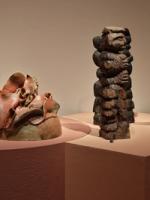
Mrinalini Mukherjee worked extensively with hemp, clay, bronze and natural dyes, drawing inspiration from everyday indigenous practices.
In giving form to the narrative of Mrinalini Mukherjee and her circle, Msoma Architects extend their own practice’s ongoing inquiry into how spatial design can deconstruct colonial hierarchies of knowledge and production, while reimagining sustainability through cultural continuity. By engaging the Baroda School’s synthesis of modernism and vernacular crafts, the design foregrounds how decolonial practice in art can align with decarbonised practice in architecture.
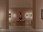
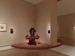
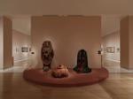
At the heart of the design are two primary geometries - the circle and the square -which together structure the visitor’s movement and perception throughout the galleries. The circle, representing Mrinalini Mukherjee herself, becomes a recurring motif that anchors the exhibition narrative, connecting the works of her mentors, peers, and family members in a continuous rhythm of alignment and tension. The square, highlights influences from her mentors, parents and the institutions, the Kala Bhavana in Santiniketan and the Faculty of Fine Arts in Baroda, that shaped the intellectual and artistic ecosystem of South Asian modernism. These forms interlock spatially in the exhibition echoing the dynamic interplay between individual artistic intuition and collective learning. This geometry becomes more than a visual device - it is a spatial manifestation of relational art history, mapping the intersections between people, pedagogy, and place that defined Mukherjee’s creative world. Materially, Msoma Architects extends the Baroda School’s decolonial philosophy into the built environment. The exhibition is constructed using earth-based plasters, natural pigments, and clay surfaces, drawing tactile continuity between the works on display and the plinths that frame them. These materials are sourced and fabricated through recyclable processes. This is our third exhibition using clay, both as an elemental and cyclical material, to connect the context of the exhibition back to the land. This grounding in material honesty stands in contrast to the polished neutrality often found in Western museology, instead offering an environment that is feminine, breathes, absorbs light, and carries the patina of its making. Photos by Thomas Adank
Interlocking circular and orthogonal plinths reveal the shared narratives between Mrinalini and her mentors, finished in bio-based clay inspired by traditional Gujarati Bhonghas.
Charcoal-clay numbers were crafted for object wayfinding by Sthuthi Ramesh of All Round Design.
Creating a natural dialogue between contemporary spatial design and South Asian material traditions.
Graphics designed by Sthuthi Ramesh at All Round Design. Labels are handmade catechu and ivory hemp papers from India, screen-printed with bronze lettering - an echo of Mukherjee’s own use of hemp, bronze and other earthy, tactile materials
